Designing your career page with themes
Last updated: October 13, 2026
Design your Kula-hosted career page in the career page builder. A theme holds your brand's look (colours, fonts and buttons) and the sections that make up the page, such as a hero banner, your open jobs, your story and your team. You can keep more than one theme, for example to work on a redesign, but only the theme you publish is live.
Who can do this: Super Admin, Admin
Where to find it: Settings → Career page → Career Page Builder → Themes tab → Selected Theme Details → Add Styles and Sections.
Open a theme
Go to Settings → Career page and job boards → Career page builder and open the Themes tab.
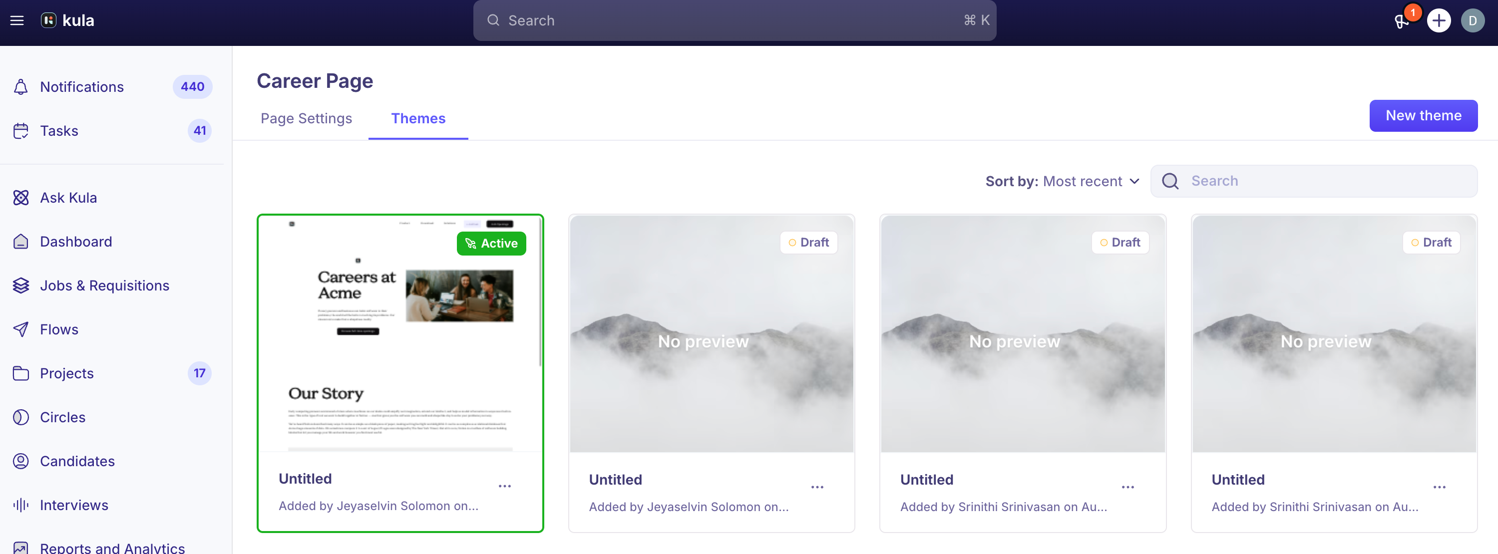
Open the theme you want to change, or click New theme and give it a name.
In the builder, click Add Styles and Sections. The panel has two tabs: Styles for the look of the whole page, and All Sections for the building blocks.
Style the page
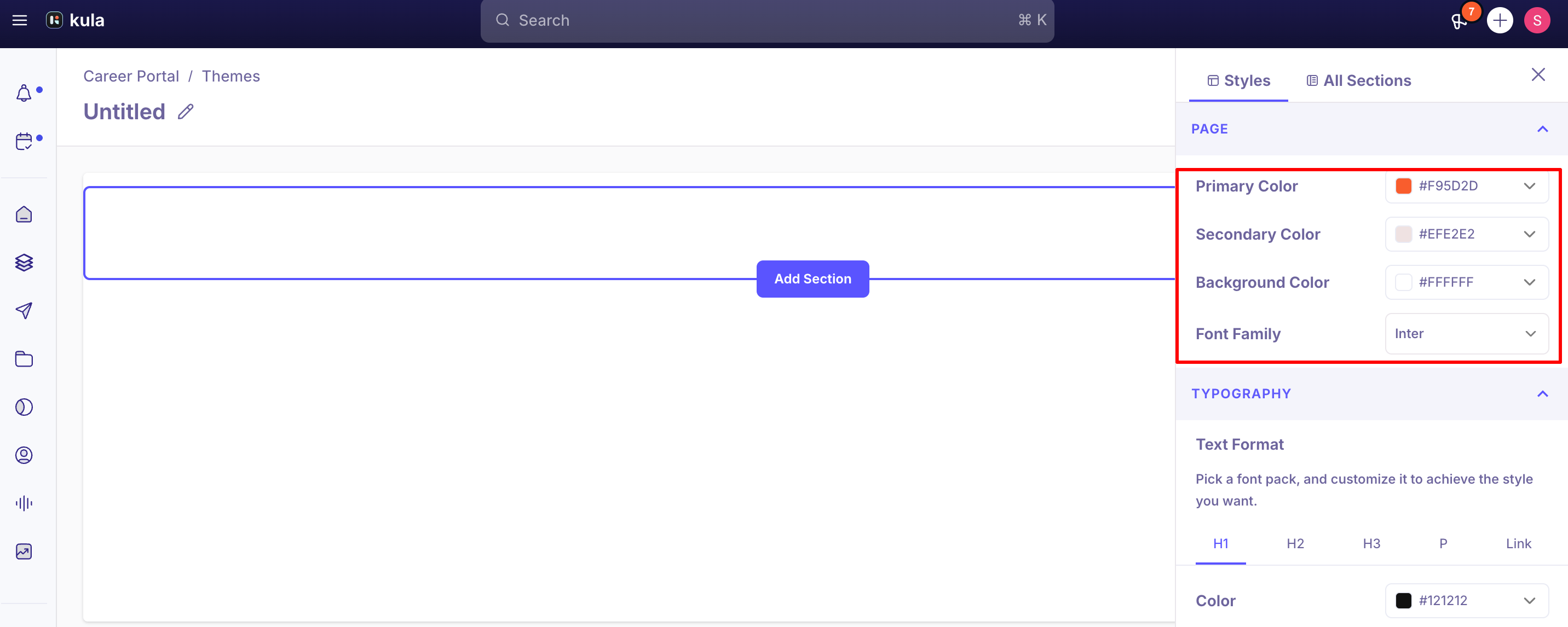
On the Styles tab, set:
Group | Settings |
|---|---|
Brand | The page background colour, Primary Color and Secondary Color. Buttons, links and accents across the page follow these colours. Backgrounds can be solid or a gradient. |
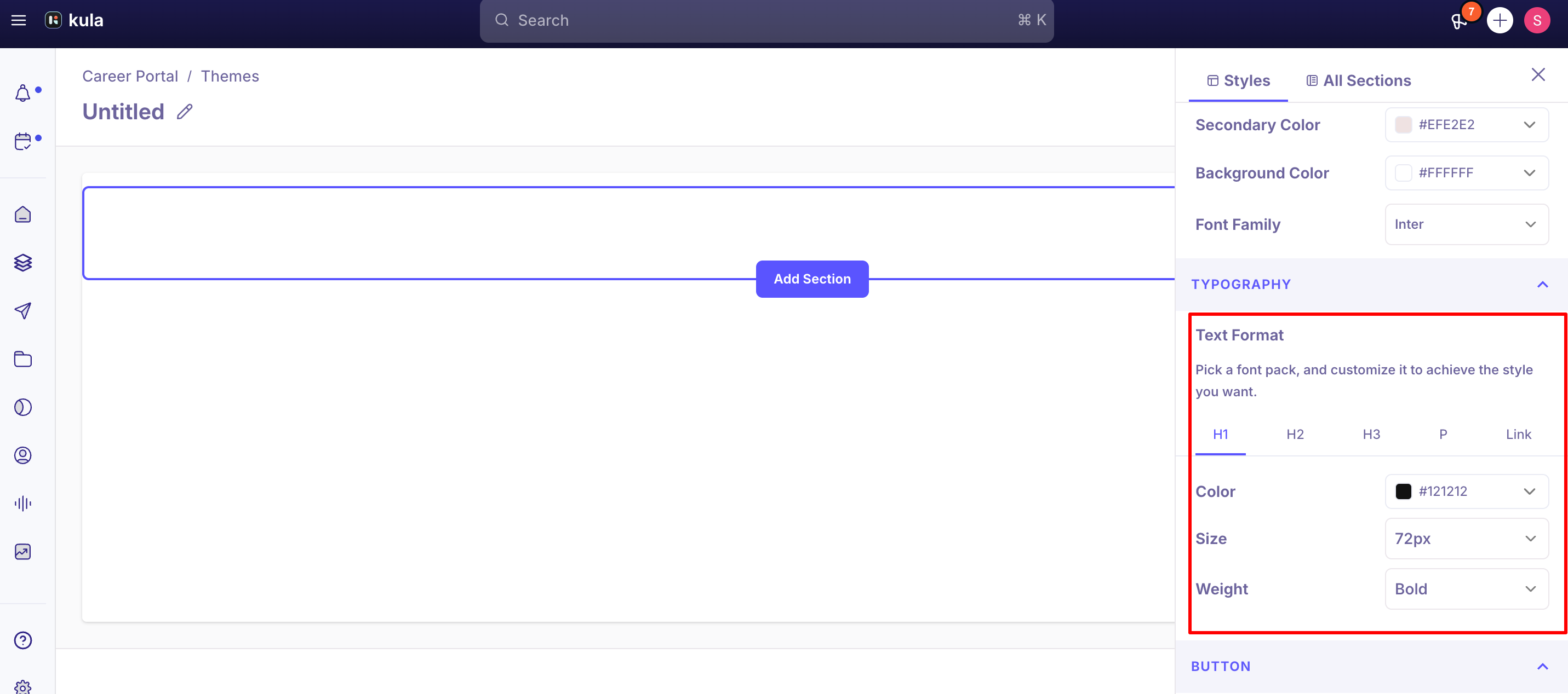
Typography | Font, size, weight and colour of the page text, and how links look. |
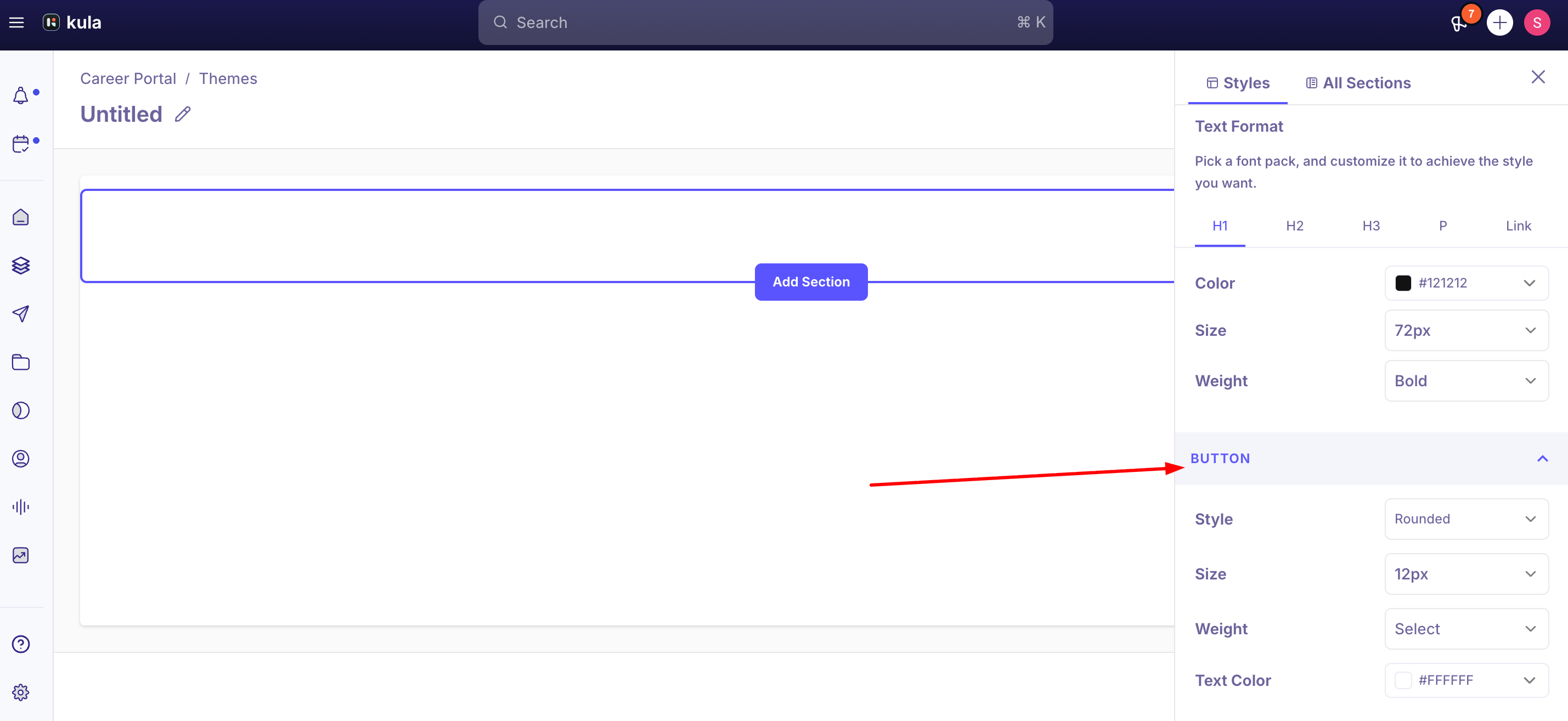
Button | Style, size, weight, font, background colour and text colour of buttons. |
Use your own font
Choose a font from the list, or add one from Google Fonts:
In Typography, open the font list and choose Add Custom Font.
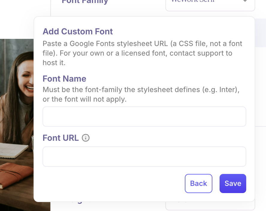
Enter a name for the font and its Google Fonts stylesheet URL, for example
https://fonts.googleapis.com/css2?family=Inter&display=swap.Save it and select it.
The font URL must:
start with
https://link to a stylesheet (a
.cssURL), not a font file such as.woff2or.ttfcome from Google Fonts. Other hosts are rejected. To use a paid or in-house font, contact support and we can host it for you
be 255 characters or fewer. Request one font family per URL
You can edit or delete a custom font later. A font the theme is using can't be deleted, so switch to another font first.
Add and arrange sections
Open the All Sections tab. Each section shows how many layouts (variants) it has.
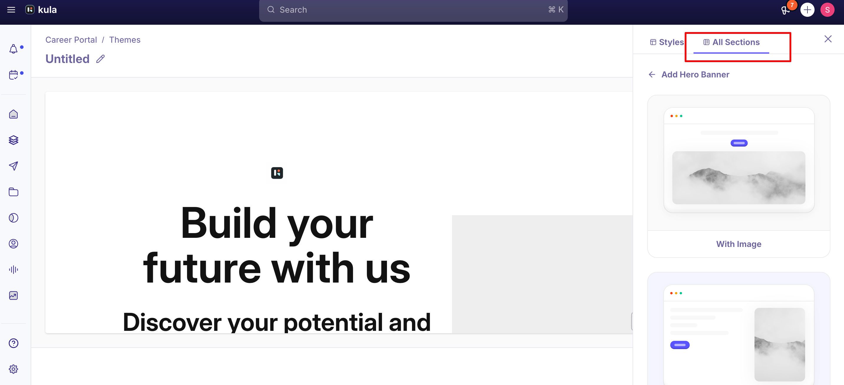
Choose a section and a layout to add it to your page.
Click any text or image on the page to edit it in place.
To change a section's settings, swap its layout, move it or remove it, use the controls on the section itself.
Section | Layouts | What you can set |
|---|---|---|
Navigation | Default, Centered Links | Show or hide the button; background colour; your logo and links |
Hero Banner | With Image, Horizontal, With Background Image | Show or hide the heading, sub heading, logo and button; image or no image; background colour; background image (With Background Image layout) |
Image Gallery | Grid | 2, 3 or 4 columns; show or hide the heading and sub heading; background colour |
Open Jobs | Grid, Accordion | Show or hide the heading and sub heading; background colour. Lists your published jobs |
Story | Image on right, Image on left | Show or hide the heading, sub heading, story text and image; background colour |
Testimonials | One layout | Show or hide the heading and sub heading; 2, 3 or 4 columns; background colour. Each testimonial has a quote, a name and a role or department |
Team | Small Images, Large Images | Show or hide the heading and sub heading; 2, 3 or 4 columns; background colour. Each person has a photo, name, role, a short "about" and optional X and LinkedIn links |
FAQs | Vertical, Horizontal | Show or hide the heading and sub heading; show questions as an Accordion or a List |
Footer | V1, V2 | Background colour, links, and social links for X (Twitter), LinkedIn, Instagram, YouTube, Facebook and TikTok |
Save and publish
Click Save. Your changes are kept in the builder but aren't live yet.
When you're ready, click Publish, then Publish again to confirm. This theme is now your live career page
Logo and favicon
Upload your logo and favicon under Page Settings → Logo & Favicon. They're used across your career page.
Good to know
Nothing is live until you publish. Save keeps your work in the builder; Publish updates your career page.
Sections appear on your career page's home page. Job description and application pages use your theme's colours and fonts, but not section settings such as the hero banner's background image.
One font family per theme. Headings and body text use the same font.
Changing layout keeps the section. Swap to another layout of the same section instead of removing it and adding it again.
Formatted text in job descriptions can override your theme. Text pasted with its own colours keeps them. Paste as plain text, or clear the formatting.
There's no custom CSS. Styling is limited to the options in the builder.
One live career page per account. For separately branded sites, for example two sub-brands, build your own pages and pull each brand's jobs in through the Job Boards API.
There's no custom HTML, CSS or JavaScript. Styling and content are limited to the options in the builder. For full control over the design and code, build your own career page with the Job Boards API.
FAQ
Where do I change my career page's colors? Settings → Career page → Career Page Builder → Themes tab → Selected Theme Details → Add Styles and Sections. Primary, Secondary, and Background colors are set there and apply across the page.
Can I use my own font instead of a Google Font? Yes — provide a public CSS stylesheet URL (not a direct link to a font file). Paid or otherwise non-Google fonts need to be hosted with their own CSS stylesheet first; free Google Fonts work without any extra hosting.
Can I remove the "Made with Kula" branding from my career page? This has been done for at least one customer, but as a specific request rather than a documented self-serve setting. Contact support to ask whether this is available for your account.
Can we have two different career pages with different branding under one Kula account? Not through the Theme Builder — a Kula account supports a single Careers Page and theme. If you need genuinely separate branded sites (for example, for two sub-brands), the supported approach is to build them yourself and pull each brand's jobs in via the Job Board API, filtered by department.
Is there a way to write custom CSS for more control over the design? Not currently — styling is limited to what the Theme Builder exposes (colors, fonts, buttons, section layout options). Deeper CSS customization is on the backlog but not available today.
Can I add custom HTML, CSS or JavaScript to my career page? Not currently. Styling and content are limited to what the Career Page Builder offers (colors, fonts, buttons and section layouts). If you need full control, your developer can build your own career page with the Job Boards API and show your Kula jobs on it.
Need help?
If a color, font, or section isn't rendering the way you configured it, contact Kula support with your theme name and a link to the affected page.